Our Site
Runtime Graph
Here is a sample of the Runtime graph that is produced by the WatchLink software:
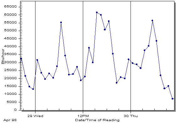
This graph shows each hour of data that was collected by the DataWatcher. The Date/Time that the data was collected is on the horizontal axis, and the Runtime % or Rate of Use is shown on the vertical axis. The graph can be easily zoomed in to a shorter time period by simply dragging a rectangle on the graph with the mouse. An "Unzoom" button is provided to allow you to progressively unzoom the graph one level at a time.
As well as showing each hour of collected data, the graph can be customized to show 4-hour averages, 8-hour averages, etc. up to 1 month averages. These views are better for observing long-term trends, or allowing you to match the DataWatcher data to other data that is summarized on longer time periods (e.g. daily weather data).
Copyright © 2006. If you have questions or comments, please send mail to info@energytools.com.