Our Site
Hourly Profile Graph
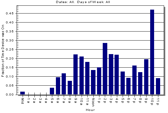
Here is a sample of the Hourly Profile graph that is produced by the WatchLink software:

This graph shows how much the monitored device ran, on average, for each hour of the day. The above graph was generated from logging my home computer monitor for about 5 weeks. In the hour starting at 1 p.m. (1 - 2 p.m.), the monitor ran for about 15% of the hour, on average. The 15% is the average runtime for the 35 different 1-2 p.m hours that were collected (there were about 35 days of monitored data). The dips in usage for lunch and dinner are apparent in the graph.
The WatchLink software also allows you to view this graph for a subset of the collected data. For example, you can have the graph only include weekdays, or you can view it for just Wednesdays.
Copyright © 2006. If you have questions or comments, please send mail to info@energytools.com.